How To Add A Fifth Column To Beaver Builder’s Footer Widget Area
Since widgets have been native to the Appearance > Widgets area, I wanted to keep that familiar set up instead of using Beaver Builder’s really cool global rows/sections ability which you could certainly use to achieve the same or similar result.
This article assumes you’re using the Beaver Builder Theme + Child Theme setup.
I strive to customize things in a way that makes since, works the way you would expect, and is simply logical.
The code below will work in such a way that if Footer Column 5 does not actually contain any widgets, the footer area will be built just as before whether or not you use 1 or 4 columns, it’s still dynamic.
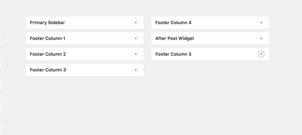
Create The Footer Column 5 Widget
Add this code to your functions.php file. This removes the footer widget areas, so we can add the 5th grouped together with the other 4.
add_action( 'widgets_init', 'gs_custom_widgets', 11 );
function gs_custom_widgets() {
 unregister_sidebar( 'footer-col' );
 unregister_sidebar( 'footer-col-2' );
 unregister_sidebar( 'footer-col-3' );
 unregister_sidebar( 'footer-col-4' );

 if ( 'disabled' != $footer_widgets_display ) {
  register_sidebars( 5, array(
   'name' => _x( 'Footer Column %d', 'Sidebar title. %d stands for the order number of the auto-created sidebar, 5 in total.', 'fl-automator' ),
   'id' => 'footer-col',
   'before_widget' => '<aside id="%1$s" class="fl-widget %2$s">',
   'after_widget' => '</aside>',
   'before_title' => '<h4 class="fl-widget-title">',
   'after_title' => '</h4>',
   ) );
  }
}
Setup 5 Column CSS for Bootstrap
Beaver Builder is built with the most famous Bootstrap which is fantastic. Its only drawback that I seem to always need to compensate for is it’s lack of 5 equal columns in a row that stretch all the way across without have to use push/pull classes. You can add this to your style.css file.
.col-xs-5ths,
.col-sm-5ths,
.col-md-5ths,
.col-lg-5ths {
  position: relative;
  min-height: 1px;
  padding-right: 15px;
  padding-left: 15px;
}

.col-xs-5ths {
  width: 20%;
  float: left;
}

@media (min-width: 768px) {
 .col-sm-5ths {
  width: 20%;
  float: left;
 }
}

@media (min-width: 992px) {
 .col-md-5ths {
  width: 20%;
  float: left;
 }
}

@media (min-width: 1200px) {
 .col-lg-5ths {
  width: 20%;
  float: left;
 }
}
Customize the footer-widgets file to support the 5th column
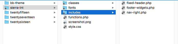
Lastly, we’re adding some conditional code to that footer-widgets.php file. Since you should be working with a child theme, within your theme folder you’ll want to have an includes folder. Within that, you need to copy the parent theme footer-widgets.php.
The code below checks if the Footer Column 5 is in use, if so we use the new 5ths classes above. If it’s not in use, then it essentially defaults back to using the display_footer_widgets() function.
<div class="fl-page-footer-widgets">
  <div class="fl-page-footer-widgets-container container">
  <div class="fl-page-footer-widgets-row row">
    <?php //FLTheme::display_footer_widgets(); ?>

    <?php if ( is_active_sidebar( 'footer-col-5' ) ) { ?>
      <div class="col-sm-5ths col-md-5ths">
        <?php dynamic_sidebar( 'footer-col' ); ?>
      </div>
      <div class="col-sm-5ths col-md-5ths">
        <?php dynamic_sidebar( 'footer-col-2' ); ?>
      </div>
      <div class="col-sm-5ths col-md-5ths">
        <?php dynamic_sidebar( 'footer-col-3' ); ?>
      </div>
      <div class="col-sm-5ths col-md-5ths">
        <?php dynamic_sidebar( 'footer-col-4' ); ?>
      </div>
      <div class="col-sm-5ths col-md-5ths">
        <?php dynamic_sidebar( 'footer-col-5' ); ?>
      </div>
    <?php } else {?>
      <?php FLTheme::display_footer_widgets(); ?>
    <?php } ?>

   </div>
 </div>
</div><!-- .fl-page-footer-widgets -->
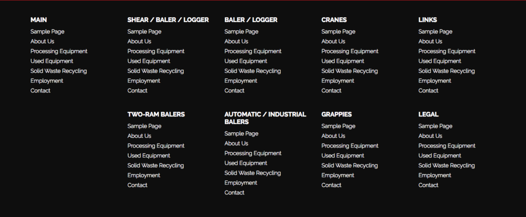
You’re welcome 😉 Now you have a nice footer sitemap with 5 columns.
Did you achieve this differently? I’d love to hear about it in the comments below!